To ChatGPT or to not ChatGPT, That is the Question
...
Read more...
Read more...
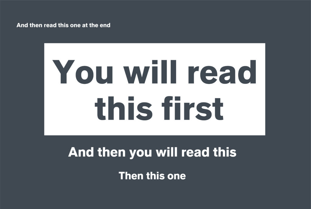
Read moreTypographic hierarchy is a system for organising text, which allows the reader to immediately understand the order of importance of what’s to be read. This is important in any design, as the easier the piece is to read visually, the more likely it is to be read and to keep your audience engaged.

From print assets – letterheads, business cards and flyers, to web design – where navigation and call to actions need to be as clear as possible for the best user experience.

Heading
The heading or title is the first thing the reader sees when glancing through content. This is of the highest importance as if it’s not engaging enough or not visually striking, the reader may flick past and never even get to the main content.
Subheading
Next down the hierarchy are the Subheadings, and these are used to separate the text into sections. This text should be less eyecatching than the header, but more visual than the text body, as this is a summary of the main content within it.
Body
Finally we come to the body text, this section is more content heavy and includes all the meaty information, so it’s crucial that it’s easy to read to ensure the reader continues all the way through to the end.
We love comedy here at PDC, myself in particular loves going to see stand-up comedians – although a bit difficult in these times! Using this sector as an example, I wanted to show how the way a listings page is displayed can impact the readability.
Eye-tracking research by the Missouri University of Science and Technology shows that when looking at a website, it takes users less than two-tenths of a second to form a first impression, spending around 2.6 seconds scanning a website before focusing on a specific area. This doesn’t surprise me at all, as personally if I don’t see what I want to see straight away I just won’t bother to look.
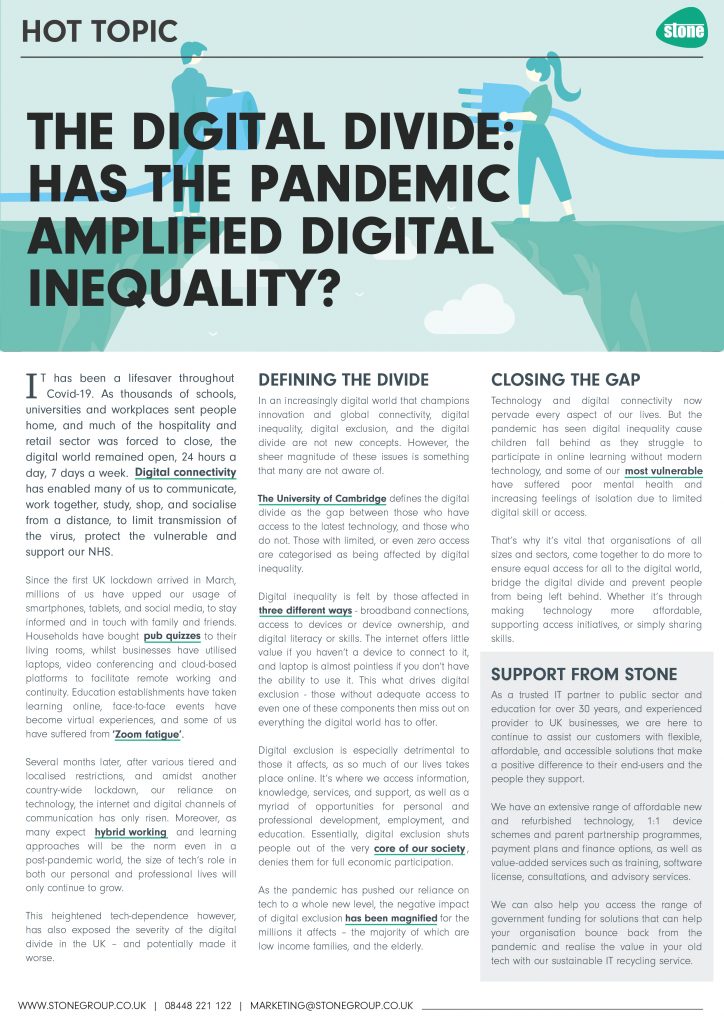
Imagine trying to find someone specific if this were a list of hundreds of comedians:

It’s a little extreme, but as you can see, without any system of hierarchy it’s actually quite painful to sift through the text to find what you’re looking for.
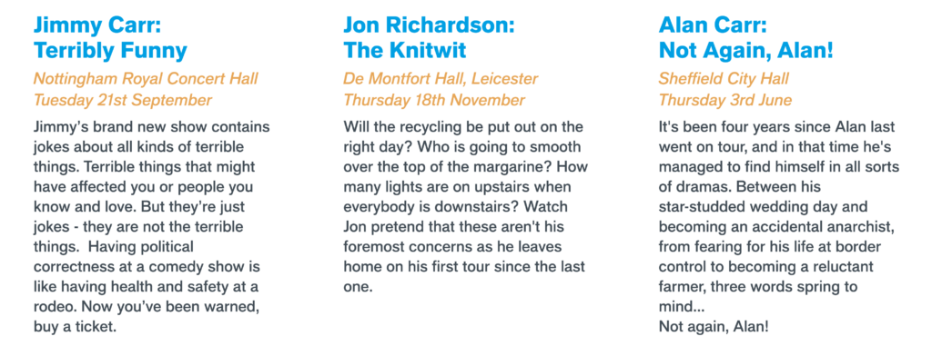
However as you can see below, by using colour and varying type size and weights, it’s easier to isolate certain sections to make it much more readable and scannable:

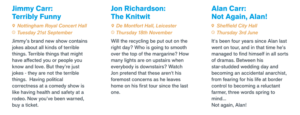
And to make it even clearer than that as well as being a bit more visual, the use of icons can also help:

Overall, there are many styling techniques that can be used to create a textual hierarchy; size, weight, colour, position, type contrast, and a lot of the time these techniques are used in combination with each other.
Understand the purpose of the text and what message it is trying to get across, decipher what is the most important content, and then present this content in the most organised way. Remove the clutter and design a clear and readable piece for your audience – less is more!