To ChatGPT or to not ChatGPT, That is the Question
...
Read more...
Read more...
Read more
The Golden Ratio is a mathematical ratio and one of the most famous irrational numbers that goes on forever. It appears all around us and you can find it almost anywhere, from the solar system to the human body. It has allegedly inspired the most famous artists such as Michelangelo and Leonardo Da Vinci, as well as Greek architects throughout history, all the way up to contemporary designs and branding today.
The golden ratio is made up of a sequence of numbers called the Fibonacci sequence, where the sum of an equation is added to the last number in the equation:
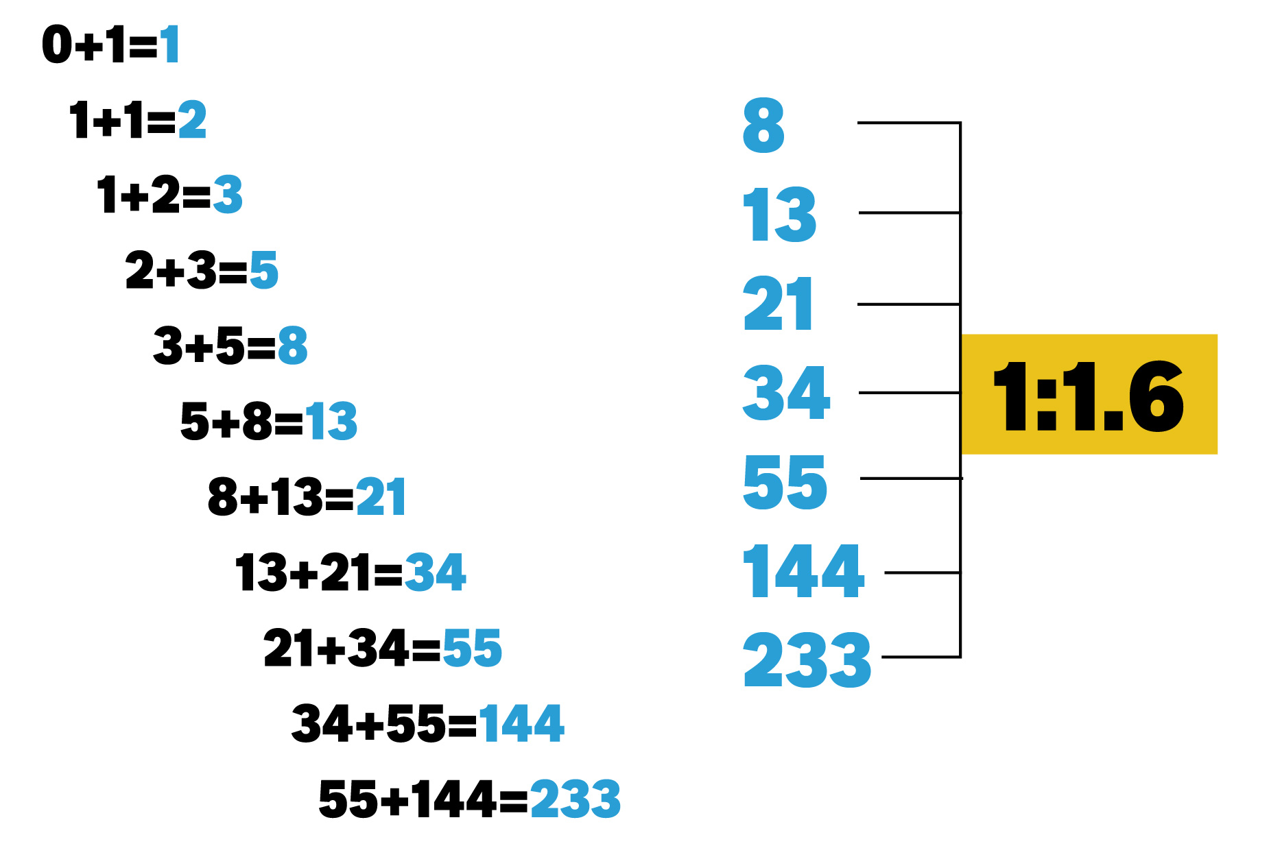
This is where you arrive at this sequence of numbers that follow the ratio 1:1.6, which remains consistent no matter how long you follow this formula.
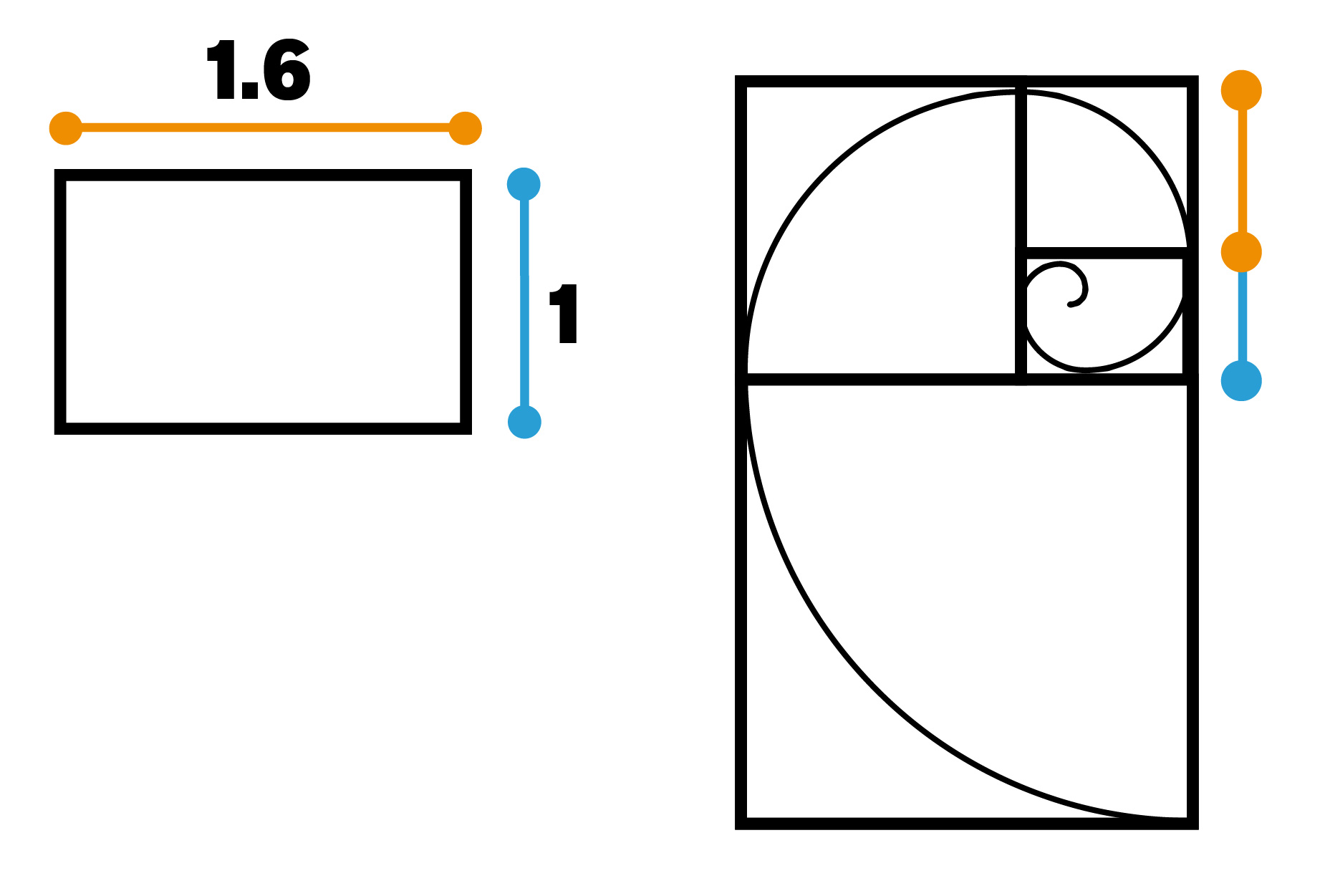
Here is a rectangle that shows the golden ratio, and if we start to make golden ratio points within this, we create a series of boxes within boxes where a spiral will fit in this measured sequence.
It turns out that this spiral fits into so many areas of life, from our solar system to embryos, and hurricanes to our DNA. The number of petals on flowers also being the same numbers from within the Fibonacci sequence.
 .
.  .
.  .
. 
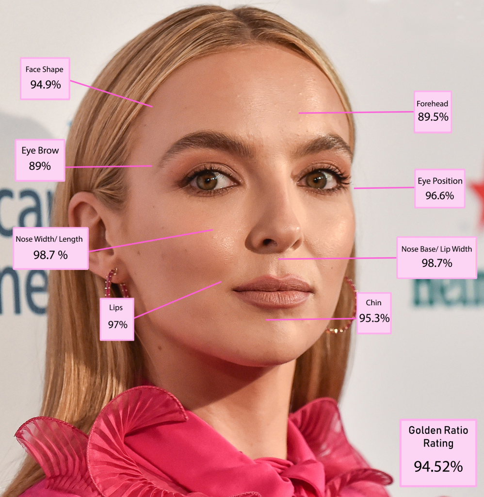
It’s mind-blowing how you can find this 1:1.6 ratio almost anywhere, our own bodies for example. From our shoulders to our elbows and elbows to our fingertips, from our elbow to our wrist and wrist to fingertips, from our wrist to our fingers and fingers to fingertips – this is all to a ratio of 1:1.6.

Whether it’s in a painting, print design or web design, one of any designer’s main goals is to create a design that’s easy for the viewer to understand and gets the message across to them in the simplest way. This is achieved by using tools available such as grids, columns and spacing rules, to create a design that’s well-balanced and displays information that’s easy to read and engage with.
By using the golden ratio in a design, it creates a path that leads the viewer’s eyes to focal areas where you’d like them to look. It’s also a great template for solving multiple design problems, as it helps to create balance and scale, even when it’s not intentional.
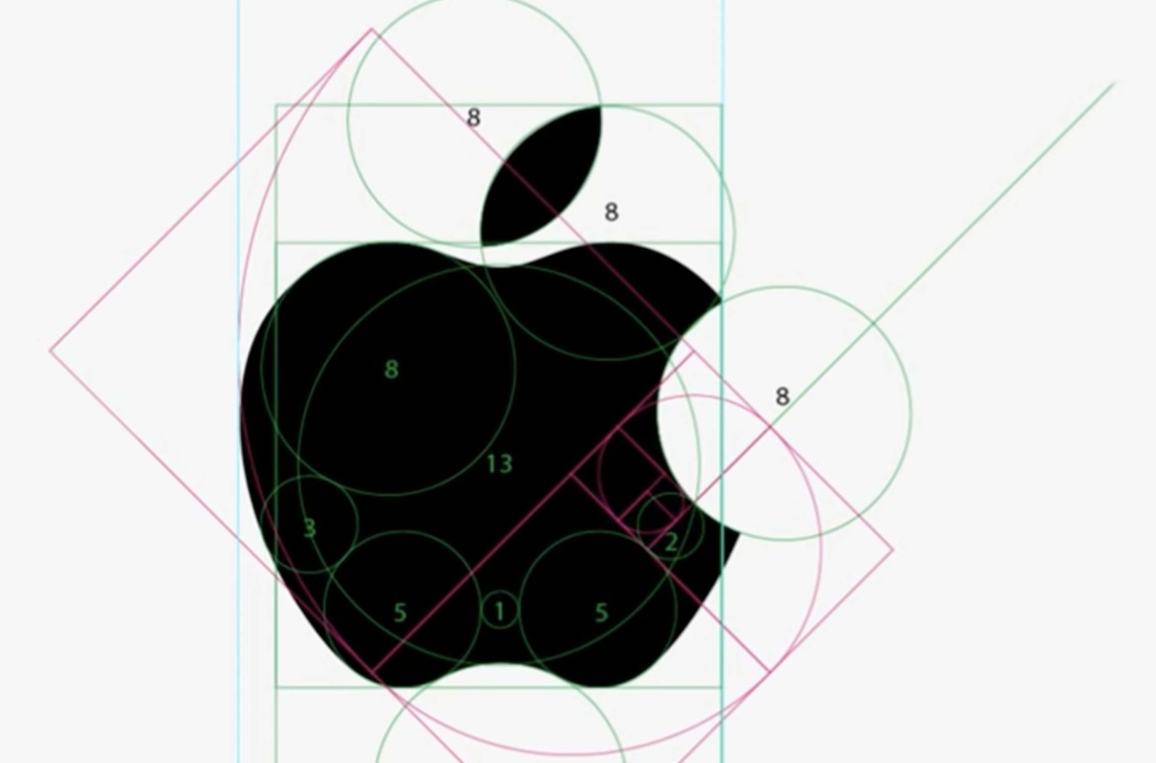
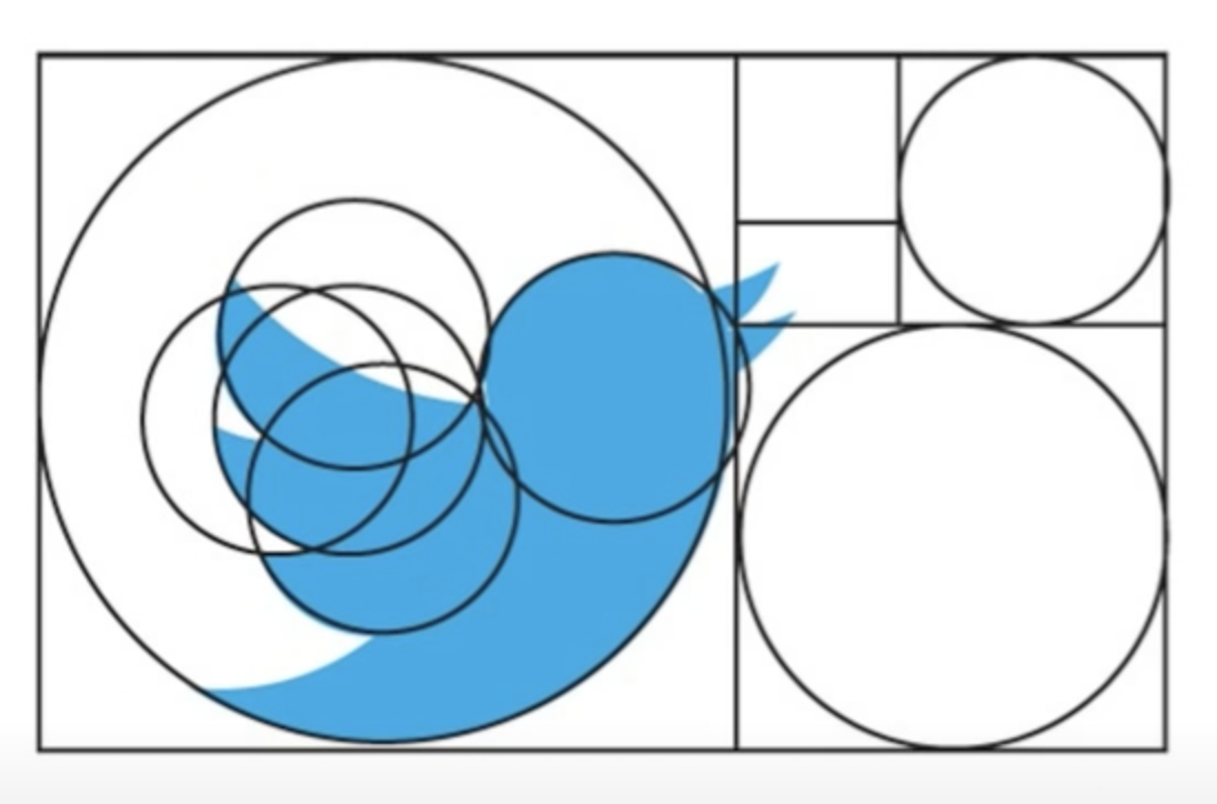
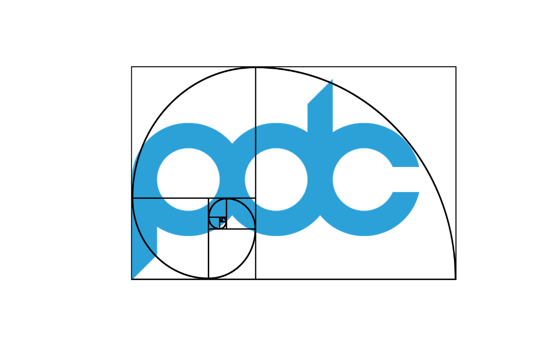
Many logos follow this theory as it creates the proportions most pleasing to our eye, brands that follow this for example are Apple, Twitter and even our logo!
 .
.  .
. 
As mentioned previously, the ratio has been implemented throughout history by architects and designers to create aesthetically pleasing designs and structures, for example the Parthenon in Greece fits this ratio with its appearance of balanced, straight lines.

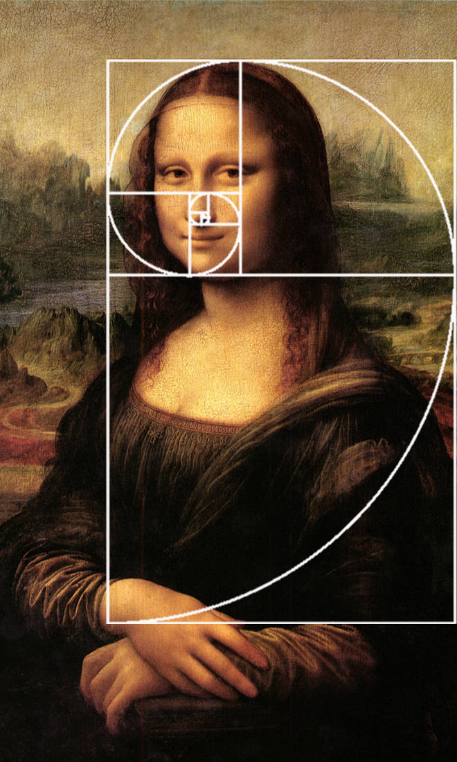
Leonardo Da Vinci’s famous Mona Lisa is painted according to the golden ratio and there are many golden rectangles throughout the painting.
It is believed that the reason the golden ratio works so well in design, is not only because it creates the perfect balance between elements, it is familiar to us as it’s embedded into our lives without us even knowing it.
Now you understand what the golden ratio is, you’ll be seeing it all around you. We’ve been finding items around the office this morning, from the work phone to the printer!
So the Golden Ratio isn’t just for pretty people, it’s for business too! If you’d like us to help you to create ‘the most beautiful design in the world’ according to science, we can help you to do just that.