To ChatGPT or to not ChatGPT, That is the Question
...
Read more...
Read more...
Read moreAs we welcome 2022, we say goodbye to 2021 – a year that had the ongoing pandemic, the prominence of the Black Lives Matter movement, and continuing our best efforts to combat the climate crisis with 77 countries in the world announcing full or partial bans on plastic bags.*
Trends in the design world are more than just random fads, they express a year’s worth of phenomenon, and these events have changed the way businesses in all sectors around the world communicate with their consumers.
So what are these trends? We’ve highlighted 8 below:
The past couple of years have certainly made people revaluate their priorities and recognise what is most important, so I feel this had to go first on the list. Mental health is such a huge part of our lives, now more than ever, and it’s come to realise that the ‘bigger is better’ mindset is not always the case. This outlook will inspire a tone of voice that’s happier and more carefree throughout the year, to help bring more comfort and positivity.
‘Go big or go home’ is what applies to Maximalist design! Say goodbye to that white space and be extravagant with colour and pattern edge to edge of the artboard, having no fear of clashing combinations. This style creates so much energy and freedom, which you could say is like a burst of expression through the restrictions after lockdown.
Bold and vibrant colours are set to take over from the more muted style of colour that’s been popular over the past couple of years. Bright block colours are certainly a way to make visuals stand out – as long as it’s done right and doesn’t take over the main focus of the page. The aim of these backgrounds isn’t to overwhelm text and icons, but to make the right information stand out, so it’s important to use them in bursts paired with white space or more muted tones.
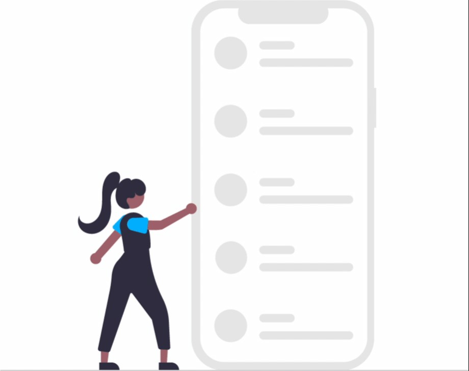
Similarly to the bright backgrounds mentioned above, icons and illustrations are heading towards this same style. These visuals portray a message at just a glance, and capture the reader’s attention over any piece of text, with most icons representing the same thing in any language – meaning they’re a great way to get your point across and communicate. Making all visuals inclusive is also a big trend of 2022, displaying the diversity of humanity respects and appreciates what makes everyone different, in terms of age, gender, ethnicity, religion, disability and sexual orientation.
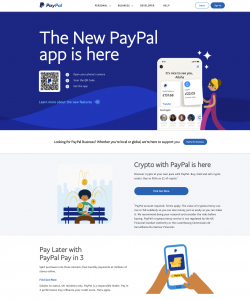
Sans-serif fonts are widely used in design as they portray a style that’s more modern and approachable. Last year however, Serif fonts started to come back and it seems are here to stay in 2022. These classic serif fonts can look outdated if they’re not used in the right way, but they are however, traditionally used in books and news articles and are seen to represent trust and reliability – so it’s no wonder they are a popular choice with banking brands. There are now so many different serif typefaces in all different styles and personalities, and paired with a nice sans-serif font they can look really effective – such as how Nationwide have utilised this on their website.
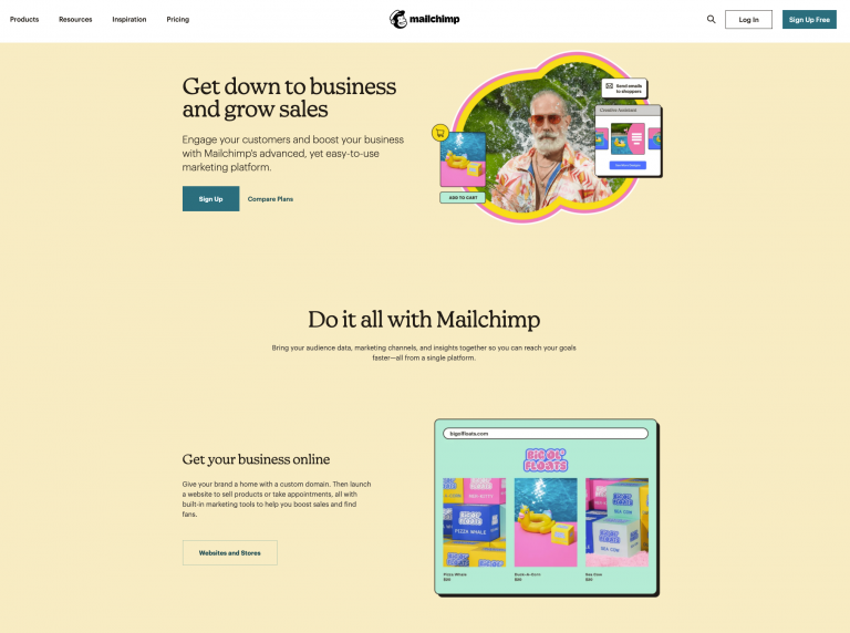
With all the unknowns and unfamiliarity in the world at the moment, people are in need of comfort, enjoyment and maybe a bit of escapism – so what’s better than throwing everything back to the 90s! Netflix’s ‘Stranger Things’ bought back the nostalgic 80s vibe, capturing the era of loud patterns and neon colours, and similarly the 90s style brings back a sense of familiarity and happiness, with the bright colours and funky shapes. MailChimp have captured this style perfectly on their website, aiding their text with nostalgic and fun visuals – and using a serif font I may add!
Motion within branding has been a trend for the last couple of years and continues to be a vital focus for brand creation. Adding movement and animation not only outlines the personality of a brand, whether it’s on social media or on your landing page, it creates much more engaging content, making a brand much more memorable.
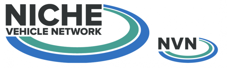
It’s a known thing to designers, that many clients wanted to ‘make the logo bigger’, however bigger doesn’t necessarily mean better – what’s most important is that the logo is always visible. With content being viewed on such a range of devices and responding to many screen sizes, it’s important that the logo adapts to still be identifiable on the largest screen and the smallest screen. Whether it’s using an icon to distinguish the brand – like Kodak have created, or abbreviating the name – like we have done for The Niche Vehicle Network, the brand is still recognised at each state.
As mentioned earlier on, the events from previous years have changed the way businesses in all sectors around the world communicate with their consumers, and looking through all these trends and their examples above, we can see a crossover with many companies already within their styles.
We hope this year brings more positivity, and the upcoming design trends look to reflect this with more visual aspects; from more inclusive representations to nostalgic and vibrant bold colours, inspiring well-being and happiness.