To ChatGPT or to not ChatGPT, That is the Question
...
Read more...
Read more...
Read more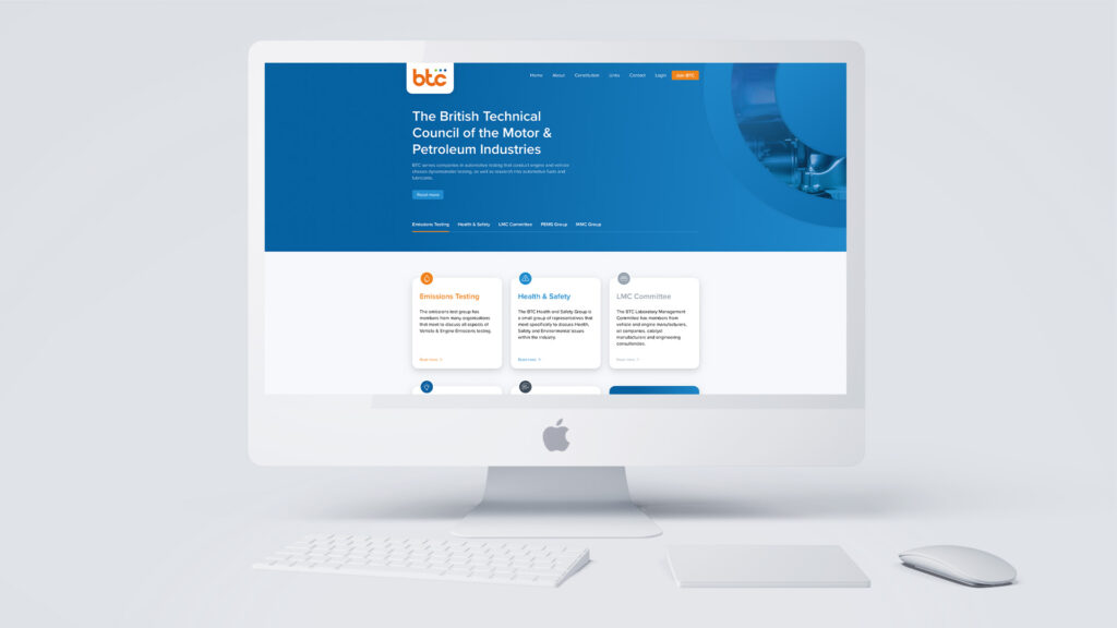
The British Technical Council of the Motor & Petroleum Industries serves companies in automotive testing that conduct engine and vehicle chassis dynamometer testing, as well as research into automotive fuels and lubricants.
The BTC Laboratory Management Committee (LMC) is made up of members from vehicle and engine manufacturers, exhaust aftertreatment system manufacturers, engineering consultancies, and related suppliers to the industry.

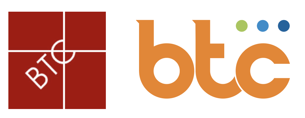
Side by side we see the evolution of old logo and the new. The newly bespoke lettering created for BTC, clearly displays the group name in a visually pleasing way, with the serifs applied to the B and T giving the logo an extra dimension. The varying colours of the 3-dot strip represents progression, with the blues and green complimenting the vibrancy of the Primary orange shade.
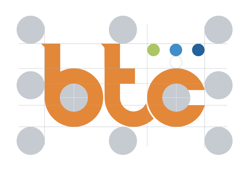
This clear zone must always be free of any other graphics or typography in order to preserve the logo’s integrety and legibility. The clear zone being padding made up of the size of the inner circles of the B & C.
Always allow at least this amount of space around the logo, as it will appear on many different formats and applications, and this will help give the logo clarity and presence.
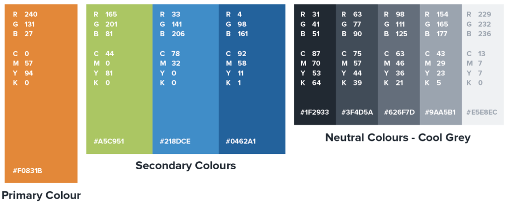
The primary orange with the supporting blues and green are the splashes of colour that will appear the most in user interaction, and are the ones that determine the overall “look”. These colours will be used for things like call to actions, links, navigation items, icons, borders, or text you want to emphasize.
The neutral colours are for main text colour, subtle backgrounds, boxes etc.
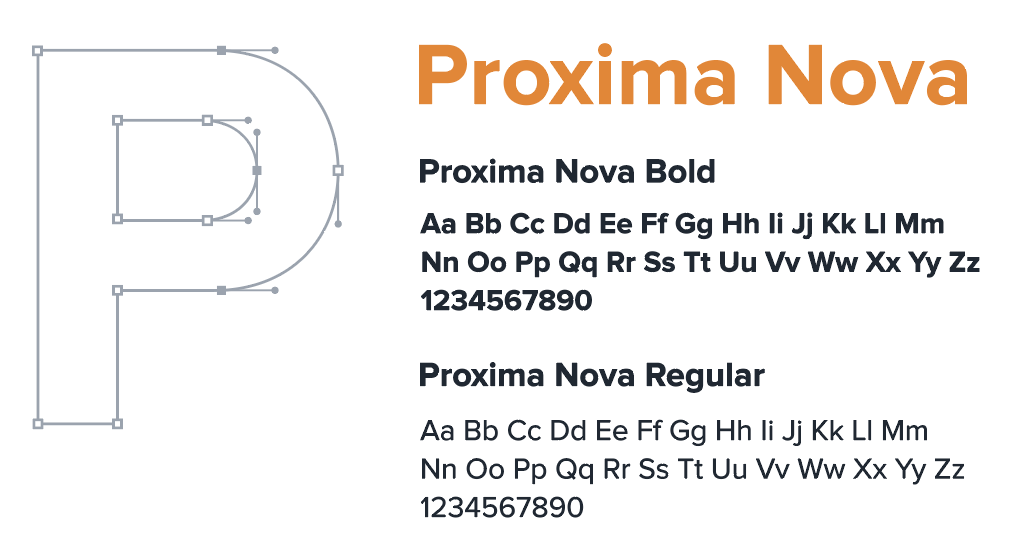
Proxima Nova typeface combines a geometric appearance with modern proportions. This rounded style font has been chosen for BTC to compliment the curves in the logo, as well as portraying a clean and professional look.
By giving BTC a brand re-fresh and using the newly created brand guidelines, we produced a vibrant eye-catching design with seamless transitions, and a clean layout that is easily read on any device.