To ChatGPT or to not ChatGPT, That is the Question
...
Read more...
Read more...
Read more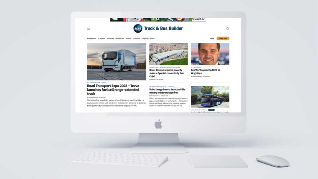
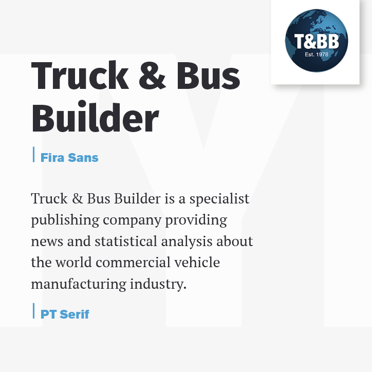
Truck & Bus Builder is a specialist publishing company providing news and statistical analysis about the world commercial vehicle manufacturing industry.
Established in 1978 by the highly respected transport journalist, Eric Gibbins, Truck & Bus Builder is recognised internationally for its accuracy and integrity and has been serving the commercial vehicle manufacturing industry for well over 40 years.

“Truck & Bus Builder is a specialist publishing company providing news and statistical analysis about the world commercial vehicle manufacturing industry.”
Typefaces help to give designs their personality; whether it’s a rounded and playful font to appeal to a child, or a handwritten style font to depict a personal letter, you need to understand your target audience.
In this case, we were portraying news and statistical analysis.

Widely used in design as they tend to communicate a contemporary and more modern approach.
The clean and distinctive edges make it a very comfortable typeface to read and can be used anywhere. They are more legible when being read from further away, which is why they are great for road signs, posters and title headings.
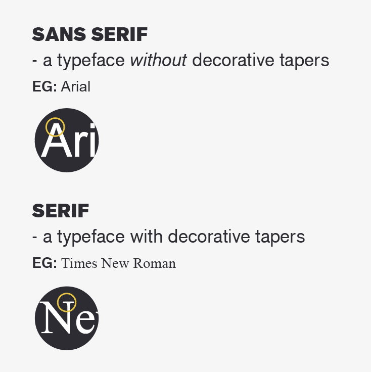
Traditionally used in books and news articles, so portray trust and reliability.
Serif typefaces can look a little outdated if they’re not used in the right way, however they have made a comeback in the last few years – recently used by Nationwide & Natwest in their branding.

The structure is a huge part of the Truck & Bus Builder website as it is quite content heavy.
The use of heavier weighted fonts in certain areas can help show the hierarchy of the page – where you want the reader to focus first and where you want their attention to be.
We decided a combination of Serif & Sans Serif would work best – having the traditional style of news with a modern and approachable feel.
After trialling many typeface pairings, we decided on Sans Serif headings with a Serif body – where there are large blocks of text, the serifs help you to identify the words quicker and therefore help the flow of reading.