To ChatGPT or to not ChatGPT, That is the Question
...
Read more...
Read more...
Read moreWeb accessibility means that websites, tools, and technologies are designed and developed so that people with disabilities can use them.
There are also strong business benefits for accessibility. Accessibility modifications overlap with other best practices such as mobile web design, usability, design for older users, and search engine optimization (SEO). This means that accessible websites have better search results, reduced maintenance costs, and increased audience reach, among other benefits.
So, what can we think about when we build our websites to make them more accessible? We’ve come up with a list here of the things we like to bear in mind; even implementing just one or two into your own site will make a massive difference!
Images should include equivalent alternative text (alt text) in the markup/code. The alt text should summarise the purpose of an image. The source filename of the image should not be included because generally it is not useful to a visually impaired user.
Providing a text transcript makes any audio information accessible to people who are deaf or hard of hearing, as well as showcasing it to search engines and other technologies that can’t otherwise hear.
It must be possible to use all of your site’s major features via a keyboard – including accessing all pages, links, content, and so on.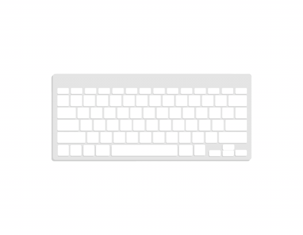
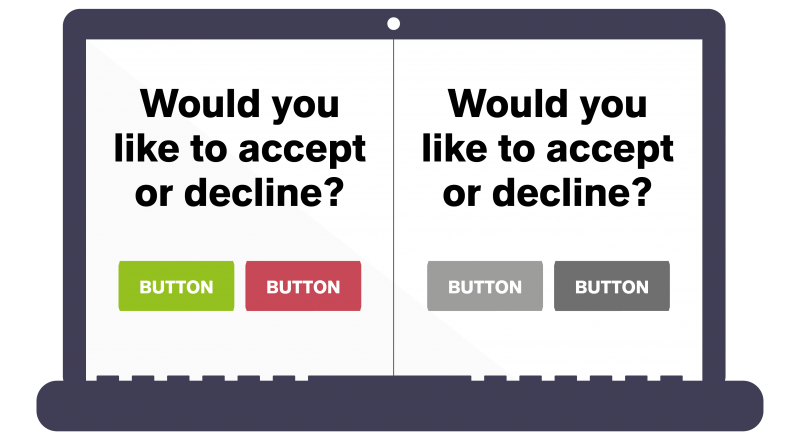
Colour-blindness spans a wide spectrum and affects different people to varying degrees. So, you need to make sure the colours you select on your site contrast well to ensure that everyone can distinguish between various elements on the page.
Adding different header levels will make your content much easier to understand and improves the flow of the page. This will also help screen readers interpret your pages.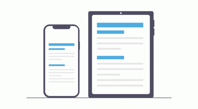
Even though it may look stylish, removing the underline from links makes it difficult for colour-blind users to see them. So, we need to make sure that links are underlined where possible.
Low-vision users, and a lot of people over 50, increase the browser default font size to make text easier to read. Absolute units such as pixels ignore this user choice. If we use relative units like EM and percentages however, they re-size according to the screen size and/or user’s preferred font size and work on a large range of devices.
These are just some of the many ways we can think about making our websites accessible. To learn more check out W3C’s comprehensive guide, or contact us today to see how we can help you to help others.