To ChatGPT or to not ChatGPT, That is the Question
...
Read more...
Read more...
Read moreThe future of going electric.
As the lines blur between the energy, infrastructure and transport sectors, EV8 helps accelerate the transition to a low-carbon world.
EV8 Switch was created to help you make informed decisions about electric vehicles and how you can harness their potential, as well finding out if transitioning to an electric vehicle (EV) is right for you the easy way.
Following the brief and the current brand guidelines, we designed a new logo for Switch that was consistent with the current EV8 Tech logo. We created an updated line icon collection, following the same style of the icons they currently had in the brand guidelines, and enhanced these with a splash of colour to make them pop on the white backgrounds.
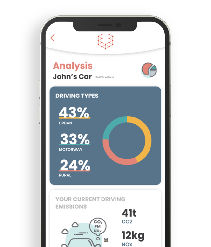
We worked with EV8 to go through their UI flow screens of the user journey through the app – where their current design theme was very dark and gave off quite an aggressive feel – which we brightened up by incorporating splashes of colour from the brand guidelines on a white background. This cleaner theme was much fresher and gave off a friendlier, more approachable feel, and by utilising this in the design along with the layering of elements, it gave each screen more depth and visual interest.
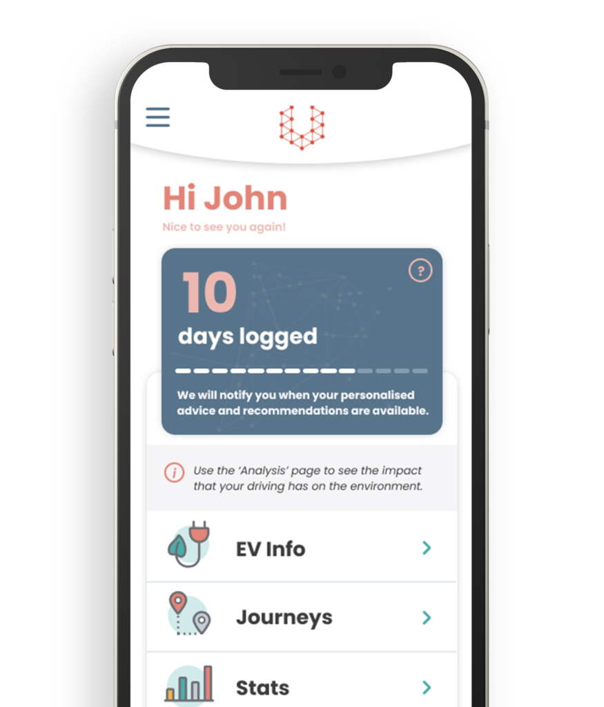
We put together multiple layouts and variations in how we recommended displaying the content to ensure the UX was the best it could be as the user explored the app. Designing up all the screens required, we covered all possible states of the user journey; from signing up to make an account, to displaying the user’s switchability score – 96 screens in total.
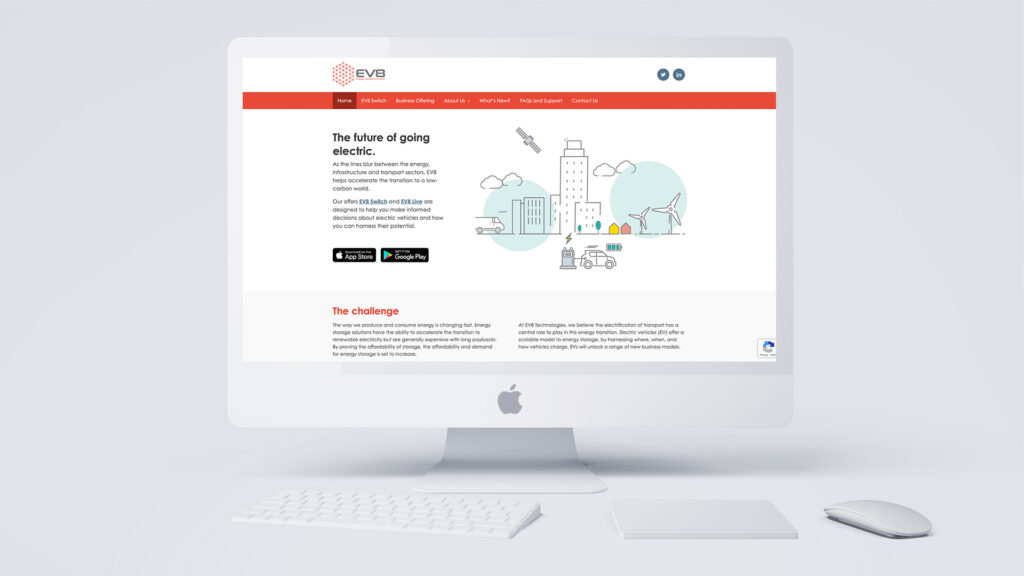
Part of the brief for the website refresh was that EV8 wanted the ability to add new pages and material very easily as time went on and that they would also need a dedicated FAQ and tech support area for the application. Using the same bright and crisp style used for the app, we produced a design that was modern and easy to navigate.
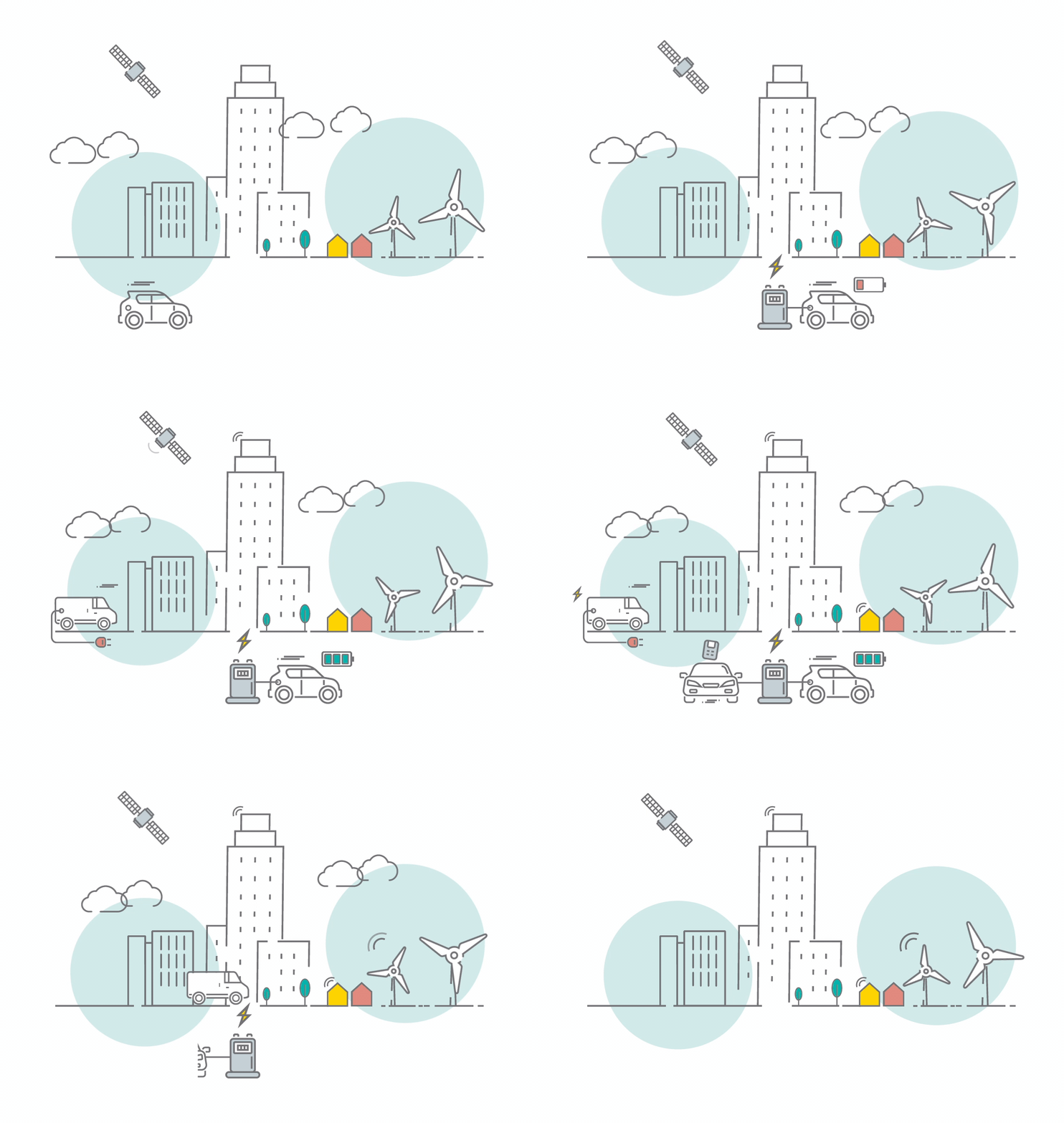
To give the website some visual interest, we made some animations in the same style as their brand guidelines icons, to make the pages pop.
Motion within branding has been a trend for the last couple of years and continues to be a vital focus for brand creation. Adding movement and animation not only outlines the personality of a brand, whether it’s on social media or on your landing page, it creates much more engaging content, making a brand much more memorable.
By reusing the assets made for website and the app, we were able to create flyers, brochure adverts and window vinyls.
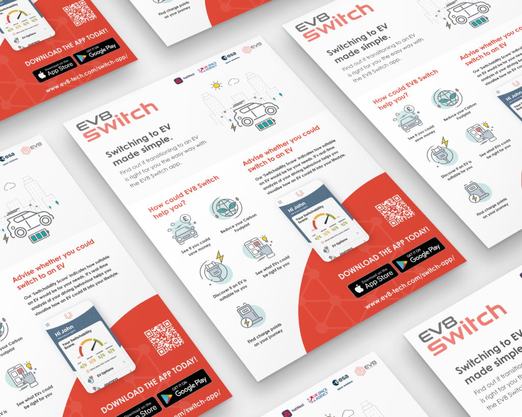
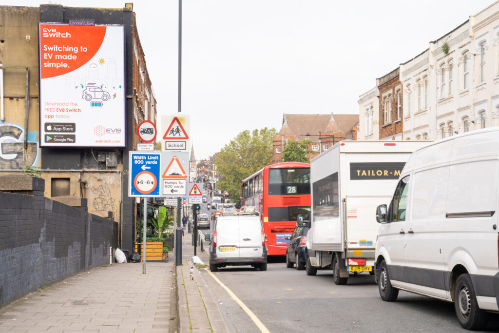
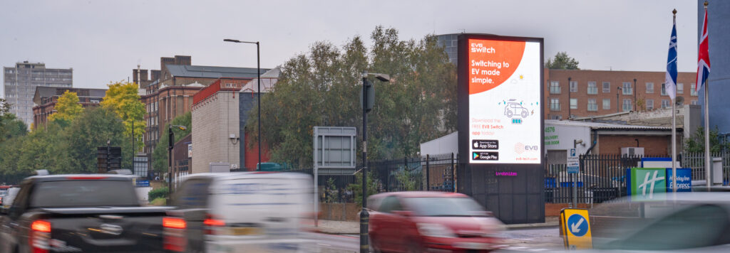
As well as the print media, we put together a graphic that was rolled out across digital billboards around multiple areas in London, promoting the EV8 Switch App. We were able to utilise the animations created for the website for social media post graphics and digital banners.
